React Cards - Flowbite
Get started with the card component to show content in a box such as titles, descriptions, and images based on multiple styles and sizes built with React
The card component can be used to show a wide variety of content such as previews of blog posts, user profiles, pricing plans, and more. Choose from one of the many examples built with React and the utility classes from Tailwind CSS.
To start using the card component you will need to import it from flowbite-react:
'use client';

import { Card } from 'flowbite-react';
Table of Contents#
- Default card
- Card with CTA button
- Card with image
- Card with custom image render function
- Horizontal card
- User profile card
- Card with form
- E-commerce card
- CTA card
- Card with list
- Pricing card
- Crypto card (web3)
- Theme
- References
Default card#
Use this example to show a simple card component with a title and description and apply the href tag to the <Card> component to set a hyperlink to the card.
- React TypeScript
'use client';

import { Card } from 'flowbite-react';

export default function DefaultCard() {
  return (
    <Card
      className="max-w-sm"
      href="#"
    >
      <h5 className="text-2xl font-bold tracking-tight text-gray-900 dark:text-white">
        <p>
          Noteworthy technology acquisitions 2021
        </p>
      </h5>
      <p className="font-normal text-gray-700 dark:text-gray-400">
        <p>
          Here are the biggest enterprise technology acquisitions of 2021 so far, in reverse chronological order.
        </p>
      </p>
    </Card>
  )
}
Card with CTA button#
By also importing the <Button> component you can add it inside the card to show a call to action button.
Noteworthy technology acquisitions 2021
Here are the biggest enterprise technology acquisitions of 2021 so far, in reverse chronological order.
- React TypeScript
'use client';

import { Button, Card } from 'flowbite-react';

export default function CardWithActionButton() {
  return (
    <Card className="max-w-sm">
      <h5 className="text-2xl font-bold tracking-tight text-gray-900 dark:text-white">
        <p>
          Noteworthy technology acquisitions 2021
        </p>
      </h5>
      <p className="font-normal text-gray-700 dark:text-gray-400">
        <p>
          Here are the biggest enterprise technology acquisitions of 2021 so far, in reverse chronological order.
        </p>
      </p>
      <Button>
        <p>
          Read more
        </p>
        <SeeSourceCodeForSVG />
      </Button>
    </Card>
  )
}
Card with image#
Add an image to the card by using the imgSrc prop and set the imgAlt prop to add an alt text to the image.

Noteworthy technology acquisitions 2021
Here are the biggest enterprise technology acquisitions of 2021 so far, in reverse chronological order.
- React TypeScript
'use client';

import { Card } from 'flowbite-react';

export default function CardWithDecorativeImage() {
  return (
    <Card
      imgAlt="Meaningful alt text for an image that is not purely decorative"
      imgSrc="/images/blog/image-1.jpg"
    >
      <h5 className="text-2xl font-bold tracking-tight text-gray-900 dark:text-white">
        <p>
          Noteworthy technology acquisitions 2021
        </p>
      </h5>
      <p className="font-normal text-gray-700 dark:text-gray-400">
        <p>
          Here are the biggest enterprise technology acquisitions of 2021 so far, in reverse chronological order.
        </p>
      </p>
    </Card>
  )
}
Card with custom image render function#
Specify your own render function for the image component for the card by using the renderImage prop. This is especially useful when
using the component with NextJS or Gatsby.

Noteworthy technology acquisitions 2021
Here are the biggest enterprise technology acquisitions of 2021 so far, in reverse chronological order.
- React TypeScript
'use client';

import { Card } from 'flowbite-react';
import Image from 'next/image';

export default function CardWithDecorativeImage() {
  return (
    <Card renderImage={() => {<Image width={500} height={500} src="/images/blog/image-1.jpg" />}}>
      <h5 className="text-2xl font-bold tracking-tight text-gray-900 dark:text-white">
      Noteworthy technology acquisitions 2021
      </h5>
      <p className="font-normal text-gray-700 dark:text-gray-400">
      Here are the biggest enterprise technology acquisitions of 2021 so far, in reverse chronological order.
      </p>
    </Card>
  )
}
Horizontal card#
Use the horizontal prop to show the card in a horizontal layout.

Noteworthy technology acquisitions 2021
Here are the biggest enterprise technology acquisitions of 2021 so far, in reverse chronological order.
- React TypeScript
'use client';

import { Card } from 'flowbite-react';

export default function HorizontalCard() {
  return (
    <Card
      horizontal
      imgSrc="/images/blog/image-4.jpg"
    >
      <h5 className="text-2xl font-bold tracking-tight text-gray-900 dark:text-white">
        <p>
          Noteworthy technology acquisitions 2021
        </p>
      </h5>
      <p className="font-normal text-gray-700 dark:text-gray-400">
        <p>
          Here are the biggest enterprise technology acquisitions of 2021 so far, in reverse chronological order.
        </p>
      </p>
    </Card>
  )
}
User profile card#
Use this example to show a user card with a profile picture, name, job title, buttons and a dropdown menu.

- React TypeScript
'use client';

import { Card, Dropdown } from 'flowbite-react';

export default function UserProfileCard() {
  return (
    <Card>
      <div className="flex justify-end px-4 pt-4">
        <Dropdown
          inline
          label=""
        >
          <Item>
            <a
              className="block px-4 py-2 text-sm text-gray-700 hover:bg-gray-100 dark:text-gray-200 dark:hover:bg-gray-600 dark:hover:text-white"
              href="#"
            >
              <p>
                Edit
              </p>
            </a>
          </Item>
          <Item>
            <a
              className="block px-4 py-2 text-sm text-gray-700 hover:bg-gray-100 dark:text-gray-200 dark:hover:bg-gray-600 dark:hover:text-white"
              href="#"
            >
              <p>
                Export Data
              </p>
            </a>
          </Item>
          <Item>
            <a
              className="block px-4 py-2 text-sm text-red-600 hover:bg-gray-100 dark:text-gray-200 dark:hover:bg-gray-600 dark:hover:text-white"
              href="#"
            >
              <p>
                Delete
              </p>
            </a>
          </Item>
        </Dropdown>
      </div>
      <div className="flex flex-col items-center pb-10">
        <No Display Name
          alt="Bonnie image"
          className="mb-3 rounded-full shadow-lg"
          height="96"
          src="/images/people/profile-picture-3.jpg"
          width="96"
        />
        <h5 className="mb-1 text-xl font-medium text-gray-900 dark:text-white">
          Bonnie Green
        </h5>
        <span className="text-sm text-gray-500 dark:text-gray-400">
          Visual Designer
        </span>
        <div className="mt-4 flex space-x-3 lg:mt-6">
          <a
            className="inline-flex items-center rounded-lg bg-cyan-700 px-4 py-2 text-center text-sm font-medium text-white hover:bg-cyan-800 focus:outline-none focus:ring-4 focus:ring-cyan-300 dark:bg-cyan-600 dark:hover:bg-cyan-700 dark:focus:ring-cyan-800"
            href="#"
          >
            <p>
              Add friend
            </p>
          </a>
          <a
            className="inline-flex items-center rounded-lg border border-gray-300 bg-white px-4 py-2 text-center text-sm font-medium text-gray-900 hover:bg-gray-100 focus:outline-none focus:ring-4 focus:ring-gray-200 dark:border-gray-600 dark:bg-gray-800 dark:text-white dark:hover:border-gray-700 dark:hover:bg-gray-700 dark:focus:ring-gray-700"
            href="#"
          >
            <p>
              Message
            </p>
          </a>
        </div>
      </div>
    </Card>
  )
}
Card with form#
You can also add form elements inside of the card component such as for sign up or login forms.
- React TypeScript
'use client';

import { Button, Card, Checkbox, Label, TextInput } from 'flowbite-react';

export default function CardWithFormInputs() {
  return (
    <Card>
      <form className="flex flex-col gap-4">
        <div>
          <div className="mb-2 block">
            <Label
              htmlFor="email1"
              value="Your email"
            />
          </div>
          <TextInput
            id="email1"
            placeholder="name@flowbite.com"
            required
            type="email"
          />
        </div>
        <div>
          <div className="mb-2 block">
            <Label
              htmlFor="password1"
              value="Your password"
            />
          </div>
          <TextInput
            id="password1"
            required
            type="password"
          />
        </div>
        <div className="flex items-center gap-2">
          <Checkbox id="remember" />
          <Label htmlFor="remember">
            Remember me
          </Label>
        </div>
        <Button type="submit">
          Submit
        </Button>
      </form>
    </Card>
  )
}
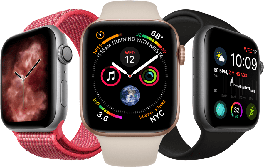
E-commerce card#
Use this example to show a product card with an image (product preview), title, price, rating stars and buttons built for E-commerce websites.
- React TypeScript
'use client';

import { Card } from 'flowbite-react';

export default function ECommerceCard() {
  return (
    <Card
      imgAlt="Apple Watch Series 7 in colors pink, silver, and black"
      imgSrc="/images/products/apple-watch.png"
    >
      <a href="#">
        <h5 className="text-xl font-semibold tracking-tight text-gray-900 dark:text-white">
          <p>
            Apple Watch Series 7 GPS, Aluminium Case, Starlight Sport
          </p>
        </h5>
      </a>
      <div className="mb-5 mt-2.5 flex items-center">
        <SeeSourceCodeForSVG />
        <SeeSourceCodeForSVG />
        <SeeSourceCodeForSVG />
        <SeeSourceCodeForSVG />
        <SeeSourceCodeForSVG />
        <span className="ml-3 mr-2 rounded bg-cyan-100 px-2.5 py-0.5 text-xs font-semibold text-cyan-800 dark:bg-cyan-200 dark:text-cyan-800">
          <p>
            5.0
          </p>
        </span>
      </div>
      <div className="flex items-center justify-between">
        <span className="text-3xl font-bold text-gray-900 dark:text-white">
          $599
        </span>
        <a
          className="rounded-lg bg-cyan-700 px-5 py-2.5 text-center text-sm font-medium text-white hover:bg-cyan-800 focus:outline-none focus:ring-4 focus:ring-cyan-300 dark:bg-cyan-600 dark:hover:bg-cyan-700 dark:focus:ring-cyan-800"
          href="#"
        >
          <p>
            Add to cart
          </p>
        </a>
      </div>
    </Card>
  )
}
CTA card#
Use this component to display a call to action card for mobile applications where you feature download buttons for App Store and Google Play.
Work fast from anywhere
Stay up to date and move work forward with Flowbite on iOS & Android. Download the app today.
- React TypeScript
'use client';

import { Card } from 'flowbite-react';

export default function CallToActionCard() {
  return (
    <Card>
      <h5 className="mb-2 text-3xl font-bold text-gray-900 dark:text-white">
        Work fast from anywhere
      </h5>
      <p className="mb-5 text-base text-gray-500 dark:text-gray-400 sm:text-lg">
        <p>
          Stay up to date and move work forward with Flowbite on iOS & Android. Download the app today.
        </p>
      </p>
      <div className="items-center justify-center space-y-4 sm:flex sm:space-x-4 sm:space-y-0">
        <a
          className="inline-flex w-full items-center justify-center rounded-lg bg-gray-800 px-4 py-2.5 text-white hover:bg-gray-700 focus:outline-none focus:ring-4 focus:ring-gray-300 dark:bg-gray-700 dark:hover:bg-gray-600 dark:focus:ring-gray-700 sm:w-auto"
          href="#"
        >
          <SeeSourceCodeForSVG />
          <div className="text-left">
            <div className="mb-1 text-xs">
              Download on the
            </div>
            <div className="-mt-1 font-sans text-sm font-semibold">
              Mac App Store
            </div>
          </div>
        </a>
        <a
          className="inline-flex w-full items-center justify-center rounded-lg bg-gray-800 px-4 py-2.5 text-white hover:bg-gray-700 focus:outline-none focus:ring-4 focus:ring-gray-300 dark:bg-gray-700 dark:hover:bg-gray-600 dark:focus:ring-gray-700 sm:w-auto"
          href="#"
        >
          <SeeSourceCodeForSVG />
          <div className="text-left">
            <div className="mb-1 text-xs">
              Get in on
            </div>
            <div className="-mt-1 font-sans text-sm font-semibold">
              Google Play
            </div>
          </div>
        </a>
      </div>
    </Card>
  )
}
Card with list#
Use this component to display a card with a list of items such as your latest customers or latest orders that include an image, descriptive text and a link to view more.
Latest Customers
View all

Neil Sims
email@windster.com
$320
Bonnie Green
email@windster.com
$3467
Michael Gough
email@windster.com
$67
Lana Byrd
email@windster.com
$367
Thomes Lean
email@windster.com
$2367
- React TypeScript
'use client';

import { Card } from 'flowbite-react';

export default function CardWithList() {
  return (
    <Card>
      <div className="mb-4 flex items-center justify-between">
        <h5 className="text-xl font-bold leading-none text-gray-900 dark:text-white">
          Latest Customers
        </h5>
        <a
          className="text-sm font-medium text-cyan-600 hover:underline dark:text-cyan-500"
          href="#"
        >
          <p>
            View all
          </p>
        </a>
      </div>
      <div className="flow-root">
        <ul className="divide-y divide-gray-200 dark:divide-gray-700">
          <li className="py-3 sm:py-4">
            <div className="flex items-center space-x-4">
              <div className="shrink-0">
                <No Display Name
                  alt="Neil image"
                  className="rounded-full"
                  height="32"
                  src="/images/people/profile-picture-1.jpg"
                  width="32"
                />
              </div>
              <div className="min-w-0 flex-1">
                <p className="truncate text-sm font-medium text-gray-900 dark:text-white">
                  Neil Sims
                </p>
                <p className="truncate text-sm text-gray-500 dark:text-gray-400">
                  email@windster.com
                </p>
              </div>
              <div className="inline-flex items-center text-base font-semibold text-gray-900 dark:text-white">
                $320
              </div>
            </div>
          </li>
          <li className="py-3 sm:py-4">
            <div className="flex items-center space-x-4">
              <div className="shrink-0">
                <No Display Name
                  alt="Bonnie image"
                  className="rounded-full"
                  height="32"
                  src="/images/people/profile-picture-3.jpg"
                  width="32"
                />
              </div>
              <div className="min-w-0 flex-1">
                <p className="truncate text-sm font-medium text-gray-900 dark:text-white">
                  Bonnie Green
                </p>
                <p className="truncate text-sm text-gray-500 dark:text-gray-400">
                  email@windster.com
                </p>
              </div>
              <div className="inline-flex items-center text-base font-semibold text-gray-900 dark:text-white">
                $3467
              </div>
            </div>
          </li>
          <li className="py-3 sm:py-4">
            <div className="flex items-center space-x-4">
              <div className="shrink-0">
                <No Display Name
                  alt="Michael image"
                  className="rounded-full"
                  height="32"
                  src="/images/people/profile-picture-2.jpg"
                  width="32"
                />
              </div>
              <div className="min-w-0 flex-1">
                <p className="truncate text-sm font-medium text-gray-900 dark:text-white">
                  Michael Gough
                </p>
                <p className="truncate text-sm text-gray-500 dark:text-gray-400">
                  email@windster.com
                </p>
              </div>
              <div className="inline-flex items-center text-base font-semibold text-gray-900 dark:text-white">
                $67
              </div>
            </div>
          </li>
          <li className="py-3 sm:py-4">
            <div className="flex items-center space-x-4">
              <div className="shrink-0">
                <No Display Name
                  alt="Lana image"
                  className="rounded-full"
                  height="32"
                  src="/images/people/profile-picture-4.jpg"
                  width="32"
                />
              </div>
              <div className="min-w-0 flex-1">
                <p className="truncate text-sm font-medium text-gray-900 dark:text-white">
                  Lana Byrd
                </p>
                <p className="truncate text-sm text-gray-500 dark:text-gray-400">
                  email@windster.com
                </p>
              </div>
              <div className="inline-flex items-center text-base font-semibold text-gray-900 dark:text-white">
                $367
              </div>
            </div>
          </li>
          <li className="pb-0 pt-3 sm:pt-4">
            <div className="flex items-center space-x-4">
              <div className="shrink-0">
                <No Display Name
                  alt="Thomas image"
                  className="rounded-full"
                  height="32"
                  src="/images/people/profile-picture-5.jpg"
                  width="32"
                />
              </div>
              <div className="min-w-0 flex-1">
                <p className="truncate text-sm font-medium text-gray-900 dark:text-white">
                  Thomes Lean
                </p>
                <p className="truncate text-sm text-gray-500 dark:text-gray-400">
                  email@windster.com
                </p>
              </div>
              <div className="inline-flex items-center text-base font-semibold text-gray-900 dark:text-white">
                $2367
              </div>
            </div>
          </li>
        </ul>
      </div>
    </Card>
  )
}
Pricing card#
Use the pricing card component to show the pricing of your product or service.
Standard plan
- 2 team members
- 20GB Cloud storage
- Integration help
- Sketch Files
- API Access
- Complete documentation
- 24×7 phone & email support
- React TypeScript
'use client';

import { Card } from 'flowbite-react';

export default function PricingCard() {
  return (
    <Card>
      <h5 className="mb-4 text-xl font-medium text-gray-500 dark:text-gray-400">
        Standard plan
      </h5>
      <div className="flex items-baseline text-gray-900 dark:text-white">
        <span className="text-3xl font-semibold">
          $
        </span>
        <span className="text-5xl font-extrabold tracking-tight">
          49
        </span>
        <span className="ml-1 text-xl font-normal text-gray-500 dark:text-gray-400">
          /month
        </span>
      </div>
      <ul className="my-7 space-y-5">
        <li className="flex space-x-3">
          <SeeSourceCodeForSVG />
          <span className="text-base font-normal leading-tight text-gray-500 dark:text-gray-400">
            2 team members
          </span>
        </li>
        <li className="flex space-x-3">
          <SeeSourceCodeForSVG />
          <span className="text-base font-normal leading-tight text-gray-500 dark:text-gray-400">
            20GB Cloud storage
          </span>
        </li>
        <li className="flex space-x-3">
          <SeeSourceCodeForSVG />
          <span className="text-base font-normal leading-tight text-gray-500 dark:text-gray-400">
            Integration help
          </span>
        </li>
        <li className="flex space-x-3 line-through decoration-gray-500">
          <SeeSourceCodeForSVG />
          <span className="text-base font-normal leading-tight text-gray-500">
            Sketch Files
          </span>
        </li>
        <li className="flex space-x-3 line-through decoration-gray-500">
          <SeeSourceCodeForSVG />
          <span className="text-base font-normal leading-tight text-gray-500">
            API Access
          </span>
        </li>
        <li className="flex space-x-3 line-through decoration-gray-500">
          <SeeSourceCodeForSVG />
          <span className="text-base font-normal leading-tight text-gray-500">
            Complete documentation
          </span>
        </li>
        <li className="flex space-x-3 line-through decoration-gray-500">
          <SeeSourceCodeForSVG />
          <span className="text-base font-normal leading-tight text-gray-500">
            24×7 phone & email support
          </span>
        </li>
      </ul>
      <button
        className="inline-flex w-full justify-center rounded-lg bg-cyan-600 px-5 py-2.5 text-center text-sm font-medium text-white hover:bg-cyan-700 focus:outline-none focus:ring-4 focus:ring-cyan-200 dark:focus:ring-cyan-900"
        type="button"
      >
        <p>
          Choose plan
        </p>
      </button>
    </Card>
  )
}
Crypto card (web3)#
This component can be used for crypto and web3 related projects where you can choose which wallet you want to connect with (ie. Metamask, Coinbase).
Connect wallet
Connect with one of our available wallet providers or create a new one.
- React TypeScript
'use client';

import { Card } from 'flowbite-react';

export default function CryptoCard() {
  return (
    <Card>
      <h5 className="mb-3 text-base font-semibold text-gray-900 dark:text-white lg:text-xl">
        Connect wallet
      </h5>
      <p className="text-sm font-normal text-gray-500 dark:text-gray-400">
        <p>
          Connect with one of our available wallet providers or create a new one.
        </p>
      </p>
      <ul className="my-4 space-y-3">
        <li>
          <a
            className="group flex items-center rounded-lg bg-gray-50 p-3 text-base font-bold text-gray-900 hover:bg-gray-100 hover:shadow dark:bg-gray-600 dark:text-white dark:hover:bg-gray-500"
            href="#"
          >
            <SeeSourceCodeForSVG />
            <span className="ml-3 flex-1 whitespace-nowrap">
              MetaMask
            </span>
            <span className="ml-3 inline-flex items-center justify-center rounded bg-gray-200 px-2 py-0.5 text-xs font-medium text-gray-500 dark:bg-gray-700 dark:text-gray-400">
              <p>
                Popular
              </p>
            </span>
          </a>
        </li>
        <li>
          <a
            className="group flex items-center rounded-lg bg-gray-50 p-3 text-base font-bold text-gray-900 hover:bg-gray-100 hover:shadow dark:bg-gray-600 dark:text-white dark:hover:bg-gray-500"
            href="#"
          >
            <SeeSourceCodeForSVG />
            <span className="ml-3 flex-1 whitespace-nowrap">
              Coinbase Wallet
            </span>
          </a>
        </li>
        <li>
          <a
            className="group flex items-center rounded-lg bg-gray-50 p-3 text-base font-bold text-gray-900 hover:bg-gray-100 hover:shadow dark:bg-gray-600 dark:text-white dark:hover:bg-gray-500"
            href="#"
          >
            <SeeSourceCodeForSVG />
            <span className="ml-3 flex-1 whitespace-nowrap">
              Opera Wallet
            </span>
          </a>
        </li>
        <li>
          <a
            className="group flex items-center rounded-lg bg-gray-50 p-3 text-base font-bold text-gray-900 hover:bg-gray-100 hover:shadow dark:bg-gray-600 dark:text-white dark:hover:bg-gray-500"
            href="#"
          >
            <SeeSourceCodeForSVG />
            <span className="ml-3 flex-1 whitespace-nowrap">
              WalletConnect
            </span>
          </a>
        </li>
        <li>
          <a
            className="group flex items-center rounded-lg bg-gray-50 p-3 text-base font-bold text-gray-900 hover:bg-gray-100 hover:shadow dark:bg-gray-600 dark:text-white dark:hover:bg-gray-500"
            href="#"
          >
            <SeeSourceCodeForSVG />
            <span className="ml-3 flex-1 whitespace-nowrap">
              Fortmatic
            </span>
          </a>
        </li>
      </ul>
      <div>
        <a
          className="inline-flex items-center text-xs font-normal text-gray-500 hover:underline dark:text-gray-400"
          href="#"
        >
          <SeeSourceCodeForSVG />
          <p>
            Why do I need to connect with my wallet?
          </p>
        </a>
      </div>
    </Card>
  )
}
Theme#
To learn more about how to customize the appearance of components, please see the Theme docs.
{
  "root": {
    "base": "flex rounded-lg border border-gray-200 bg-white shadow-md dark:border-gray-700 dark:bg-gray-800",
    "children": "flex h-full flex-col justify-center gap-4 p-6",
    "horizontal": {
      "off": "flex-col",
      "on": "flex-col md:max-w-xl md:flex-row"
    },
    "href": "hover:bg-gray-100 dark:hover:bg-gray-700"
  },
  "img": {
    "base": "",
    "horizontal": {
      "off": "rounded-t-lg",
      "on": "h-96 w-full rounded-t-lg object-cover md:h-auto md:w-48 md:rounded-none md:rounded-l-lg"
    }
  }
}